A population pyramid chart is useful when you indeed to illustrate the distribution of a population by age group and sex.
The population pyramid consists of two vertical histograms that show how much of each demographic is male or female, broken down by age range.
Demographers often use population pyramids to understand the make-up of a given population. The chart can be used to look into a population of any size, from cities and countries to even the entire world population.
What kinds of questions can a population pyramid answer?
The population pyramid can illustrate the age-sex structure of a population at a glance. For example, a broad-based pyramid can indicate that a relatively large portion of the population is younger. The graph can also be used to look into the differences in age among males and females.
Irregularities in the population such as a bulge or indentation may indicate a possible change in population. Such irregularities may be caused by immigration or other issues that can affect the mortality and fertility rate of a population.
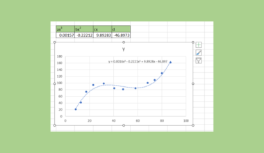
In practice, population pyramid charts are made through a modified 2-D bar chart in Excel.
This guide will explain how to make a population pyramid ourselves in Excel. We’ll also provide sample spreadsheets that you can explore yourself.
A Real Example of a Population Pyramid in Excel
Let’s take a look at a real example of a population pyramid chart being used in an Excel spreadsheet.
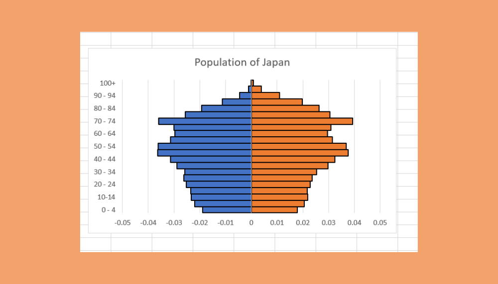
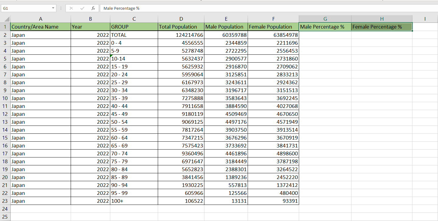
The example shown below is a population pyramid that illustrates the age-sex make-up of the country of Japan. A quick look at the chart shows a substantially broader elderly population, particularly between the ages 40 to 74.
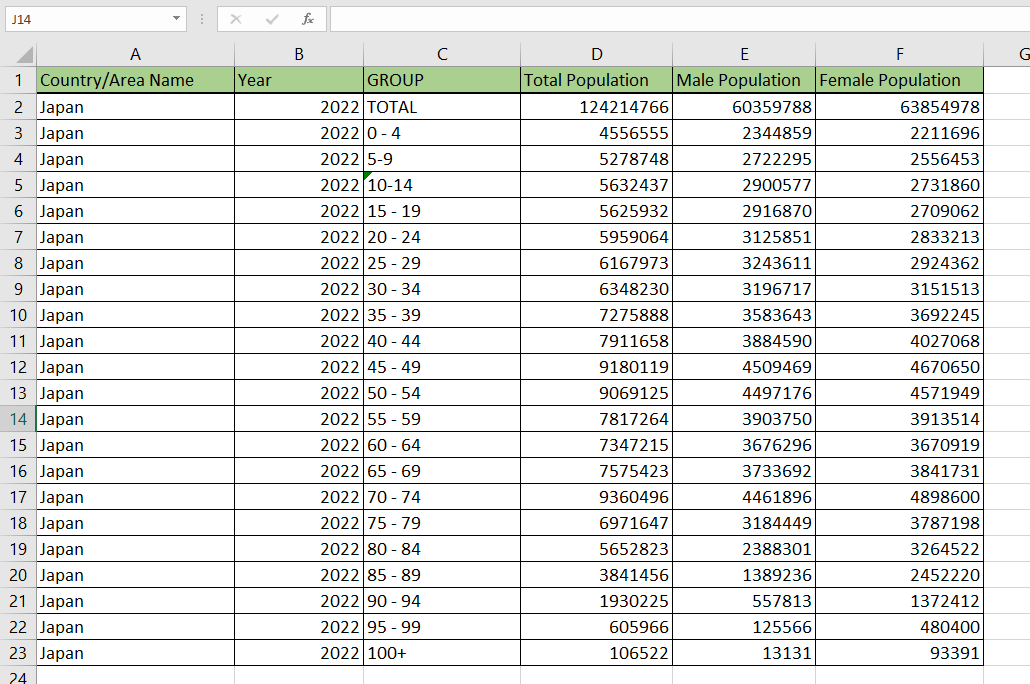
The chart uses the census data seen below. Source data must include the age ranges you would like to show. In this example, we’ve chosen a five-year age range.
You can make your own copy of the spreadsheet above using the link attached below.
If you’re ready to create your own population pyramid chart in Excel, head over to the next section to read our detailed guide!
How to Create a Population Pyramid Chart in Excel
This section will guide you through each step you need to construct a population pyramid from scratch. You’ll learn how we can use a 2D bar chart to illustrate a specific population’s age and sex composition.
Follow these simple steps to start making your own population pyramid:
- First, make sure that you have the right data needed to create the population pyramid. Your source data should have both the male and female population of various age ranges. We have the age-sex data broken down into five-year ranges in the example below.
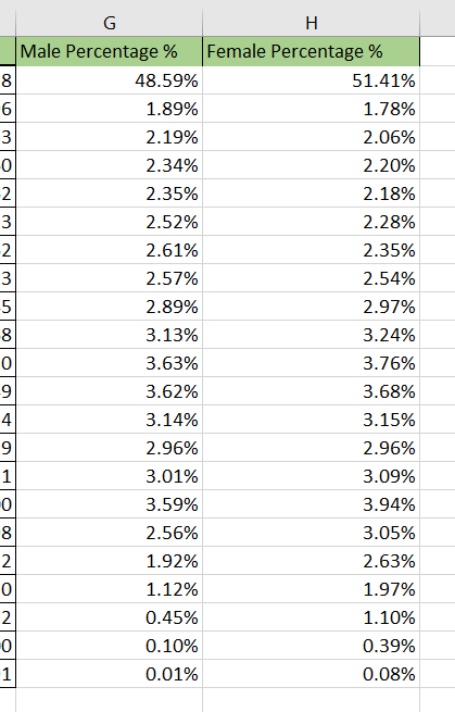
- Next, we need to make two new columns. These columns will compute the percentage of the total population of a particular segment of the population. For example, Cell G3 below should have the percentage of the total male population aged 0 to 4.
- We can compute the percentages by dividing the values in either column E or F by the total population, which we can find in cell D2. If the total population is not given, we can compute it by summing up the populations of each segment.
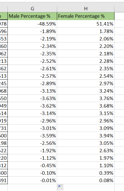
- We should convert our male percentage values to a negative value. This is to make the visualization of the male percentages stay on the left-hand side of the chart. We can achieve this by simply multiplying each value by -1.
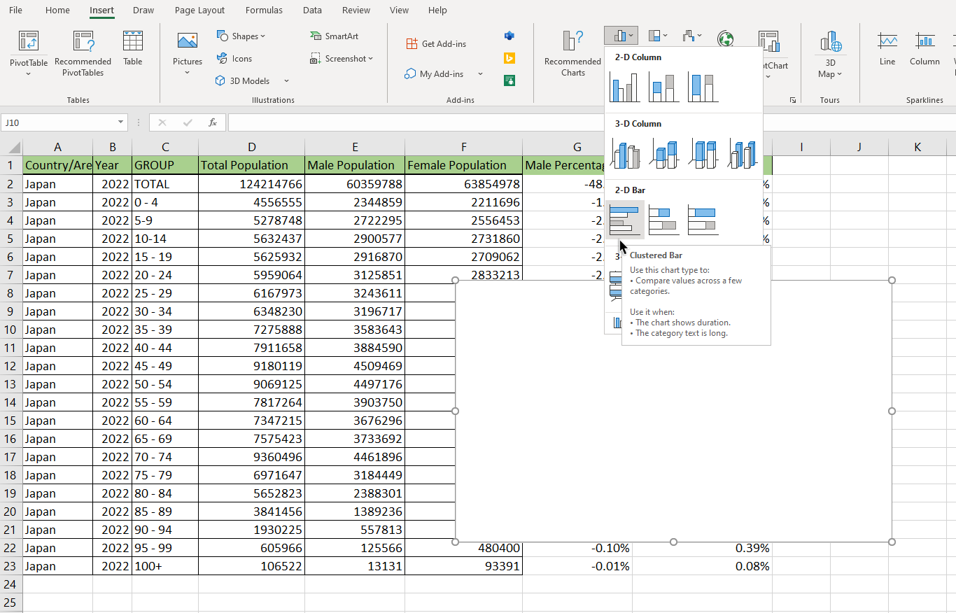
- In the Insert tab, we can find the option to add a 2-D Clustered Bar chart.
- Once an empty chart is added to the spreadsheet, right-click the empty element and click on the Select Data… option.

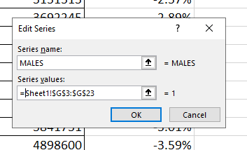
- In the Edit Series dialog box, we can add our first series. For the series name, enter ‘MALES’ and for the series values, enter the range of our male population percentages.
- Your chart should now look like the chart below. Note how Excel renders the chart’s data on the left side of the vertical axis.

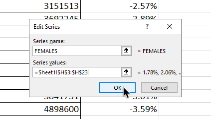
- For our next series, we can repeat step 7 but choose the range with our female population percentages.
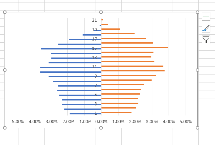
- Your population pyramid chart should now look like this with the male values on the left and the female values on the right:
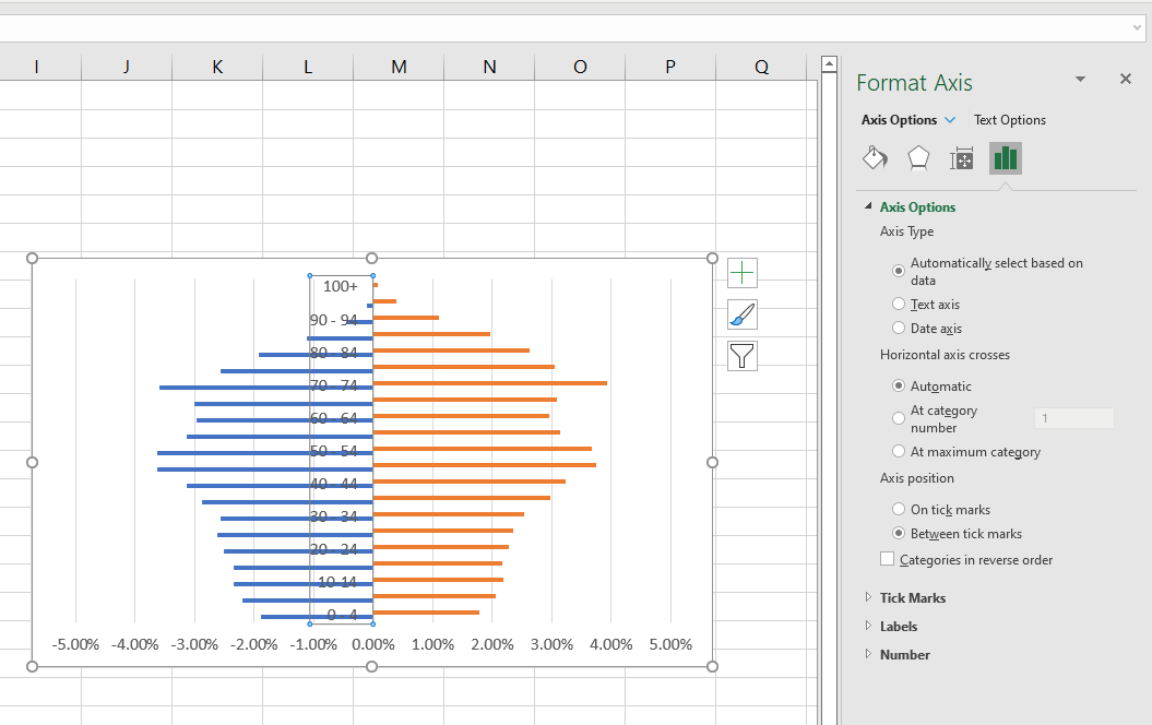
- Missing from our current chart is the labels of our age ranges. We can add a label through the Axis Labels dialog box.

- Your chart should now look similar to the example below. We can still add some more formatting options to make it more readable.

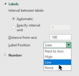
- Select the axis label element to pull up the Format Axis panel.
- Under the Labels section, select the Low option.
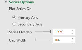
- In the Format Data Series panel, change the Series Overlap to 100% and Gap Width to 0%.
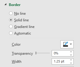
- You can also add a solid line as a border for each bar in the population pyramid chart.
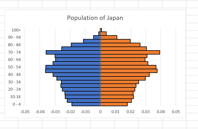
- After applying all these formatting options, your final pyramid chart should look like the example below:
That’s all you need to remember to start using the population pyramid chart in your Excel spreadsheets. This step-by-step guide shows how easy it is to illustrate the age-sex composition of a population.
The population pyramid chart is another great example of how versatile Excel is at data visualization. With so many other Excel functions, charts, and tools, you can surely find a few options that can improve your spreadsheets.
Are you interested in learning more about what Excel can do? Make sure to subscribe to our newsletter to be the first to know about the latest guides and tutorials from us.