


A combo chart combines visual points of two or more charts to present information in one cohesive and purposeful graphic.
Yes, you can make a digital chart that shows more than one data type in different ways. Google Sheets lets you make a combo chart in an easy and cloud-shareable manner.
Table of Contents
Let’s take an example.
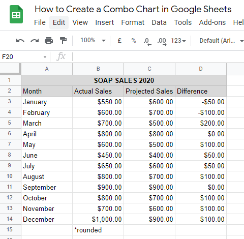
I run a small business selling soap, and I re-evaluate my sales strategies yearly. With that, I need to compare the projected and actual sales every month of the last year. Having both of that information in one chart plus their difference would make it easier to analyze.
There are many other scenarios where combo charts are useful with even more data sets. When comparing the value of homes in an area with the number of low-income, mid-income, and high-income residents, you can tabulate four different figures. There would be columns for the three categories of residents and a line to show the growth and decline of the value of homes.
Of course, it also wouldn’t be effective to just pile any number of information on top of each other just because you can do so.
Presenting your data with a combo chart is smart and thoughtful, but they’re usually only for column and line combinations. They don’t suit all situations. Visualizing parts-to-whole would be better done on a pie chart for example.
Let’s learn how to make a Google Sheet combo chart together using my hypothetical soap selling situation.
Real Example of Creating a Combo Chart in Google Sheets
Take a look at the example I’m presenting to see how to create a combo chart in Google Sheets.
Below you see a combo chart that shows all of that quantitative information in an eye-catching graphic:

The chart adjusts its data points with changes on the table. You can make a copy of the spreadsheet using the link I have attached below:
Alright, now I’ll show you how I made that chart. Let’s begin.
How to Create a Combo Chart in Google Sheets
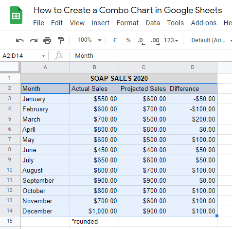
1. First, select the cells with the data you’ll use for your combo charts. In this case, that’s A2:D14.
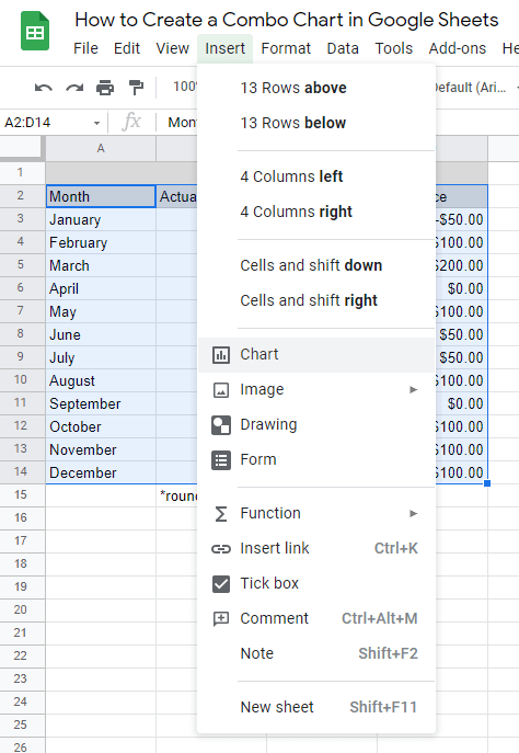
2. Next, find the Insert tab on the top part of the document and click Chart.
3. At this point, a Chart editor will appear along with an automatically-generated chart. Under the editor, make sure to choose the Combo chart option under the Chart type.
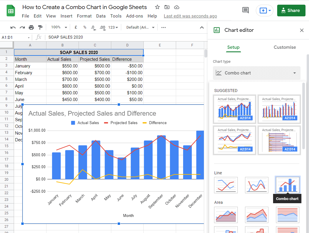
4. The chart format that comes out from this still needs to be edited to show how you want your data to be presented.
First, you’ll want to individually customize your Series. To do this, toggle the Series button under the Customise section. Then, click on the default Apply to all series drop-down button. Choose your data series one by one and format them accordingly.
In this case, I’m making sure that the Actual Sales and Projected Sales data series are in Columns Type and the Difference is in Line Type. The table will now look like this:

5. Now, let’s change the Chart and axis titles. This tab is found under the Customise settings. In my example, I don’t want “Month” to be there as the Horizontal axis title so I left that part blank. Also, I want my Chart Title to be “Soap Sales 2020”. Finally, the combo chart is polished to look like this:

Those are basic steps to making a chart like mine. You can do further customizations on your combo chart by exploring the Chart editor and I will explain how to do just that in the next section.
How to Edit a Combo Chart in Google Sheets
You’ll need to understand how the other elements of the Chart editor come into play when editing a combo chart. Let’s discuss them one by one.
Setup Section

- Stacking – This is used to exhibit part-to-whole relationships, commonly for Column Charts.
- Data range – The range of cells used for the chart.
- X-axis – The horizontal axis of your chart. Google Sheets detects this according to which part of your data range shows only text instead of numbers.
- Series – Under here are the parts of your data range that has numbers. They’re labeled according to your table.
- Checkboxes:
- Aggregate – This summarizes the date on your chart with information like sum, median, and more.
- Switch rows/columns – This reverses the position of the rows and columns of your table as interpreted on your chart.
- Use row (x) as headers – This uses the detected row as the header.
- Use column (x) as labels – This uses the detected column as labels.
Customise Section

- Chart style – This is where you can edit the aesthetics of your chart. You can check boxes: Smooth, to curve the points of your line chart; Maximise, to remove the extra empty spaces; Plot null values, to include blank values from your table; Compare mode, to allow showing additional information when hovering over data points.
- Chart & axis titles – This is where you can change the titles of charts and the axes as well as their formatting.
- Series – This is where you can edit the format of each data series. This is where you can find checkboxes to enable Error bars, Data labels, and the Trend line.
- Legend – This is where you can change the appearance as well as the position of the legend.
- Horizontal axis – This is where you can edit the color, slant, font, and position of your x-axis.
- Vertical Axis – This is where you can change the color, min/max value, scale, number format, font, and position of your y-axis.
- Gridlines and ticks – Here’s where you can be even more particular about the clarity of information on both your horizontal and vertical axes with gridlines and ticks.
That’s it. You’ve just learned how to create and edit a combo chart in Google Sheets. There are various charts you can make on this platform that are useful for statistical analysis, like a histogram. Combine this knowledge with the numerous Google Sheets formulas available, and you’ll make good use of the spreadsheet application.


